Premier High School
Campaign Identity
A charter school located in Texas and Arkansas that offers the perfect fit for a unique path.
For this project, I had the opportunity to concept and design all visual elements for this campaign.
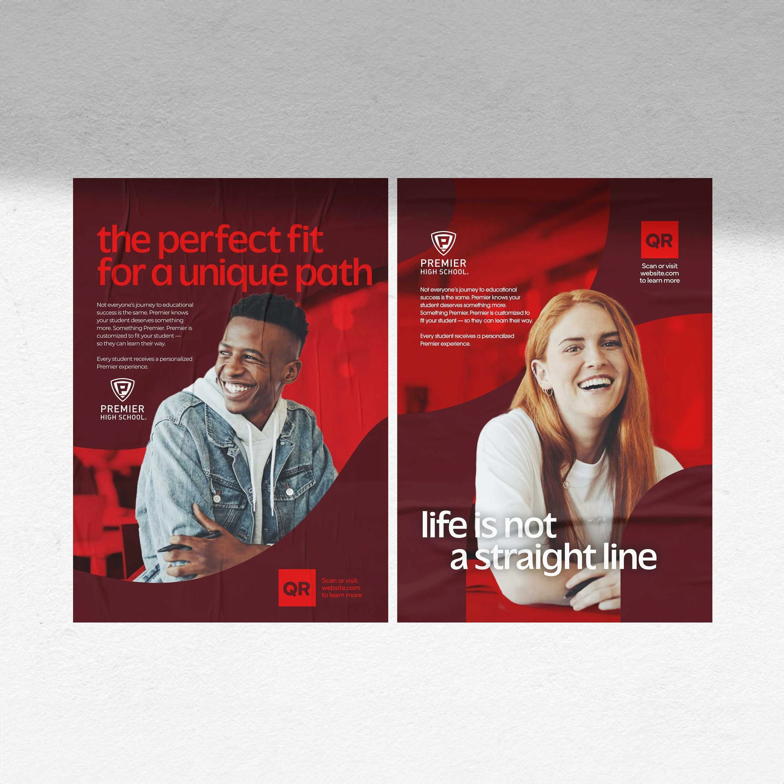
Paths can be shortcuts, scenic strolls, and accessibility routes. The path of life is not linear. There are many different paths you can take. Premier knows that and wants to walk alongside you on the path that’s right for you. Premier’s 1:1 relationships connect your student to more possibilities. Premier gets you on the path you want to be on.
The creative direction of this campaign is reflective of this unique path tailored for every student. Each piece of creative features a through-line acting as a visual reference to the paths. The students are “cut out” and breaking the boarder of the path they are placed on, showing that education is not a cookie-cutter process, and highlighting the individualism of the student in the ads. The colors used are an evolution on the existing Premier color palette. For typography, I chose a typeface that featured unique curved letterforms to mimic the pathways featured throughout.

